The Best Parish Logos Revealed: Here's Why We Love Them!
At LPi, we truly enjoy helping parishes create impactful logos and brands! Whether a church is refreshing an existing logo or starting from scratch with a new design, our talented designers work closely with parish staff to bring their ideas to life. Recently, we had the chance to sit down with a few of our designers to discuss the logos they've crafted for parishes. But before we dive into these exceptional church logos and explore why each is so effective, let’s take a moment to break down the key elements that define a strong parish logo.
Logo Characteristics Worth Noting
According to our design team, an effective and memorable logo should include these characteristics:
- Clear composition at any size: The logo should be easily recognizable, whether viewed from a distance or up close, and at large or small scales.
- Strong brand identity: It’s important that a church’s logo is distinct — if your logo is similar to those of neighboring churches, this could create confusion for parishioners and the wider community.
- Colors that reflect the church’s identity: Whether a parish leans toward a more traditional or modern feel, the logo’s colors and style should align with the church’s unique atmosphere and mission.
- A timeless look: The logo design should be one that will remain relevant years down the road and not become quickly outdated.
- Intentional simplicity: Overly complex logos can be difficult to interpret, remember, and even recognize. The design should be simple and clear enough to make an immediate impact and be recognizable at a glance.
Our Favorite Catholic Church Logos
Our team has been blessed to work with parishes all over the country to craft unique and lasting brands for their faith communities. Here, three of our designers chose a logo and share their thoughts on why they believe it stands out as a strong, successful design.
Heidi’s Choice:
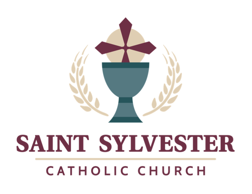
What, in your opinion, makes this a strong logo?
Many of our church customers are interested in an updated logo that can bring their parish a more modern look, while at the same time keep some sense of the traditional — which is very important in the Catholic Church. The very traditional colors with a more simplified icon and a mix of serif (traditional) and sans serif (modern) fonts creates an overall feel of seamlessness between modern and traditional.
What were some of the goals that the parish had going into this design and how did the design satisfy those goals?
The customer wanted an iconic and updated version of a previous logo that was based on a stained-glass window at their church. They also wanted to use a couple of existing colors so that they could continue to utilize staff shirts already in existence.
What do you personally like about this logo and why?
I really like the mix of strong and soft colors, the very appealing contrast, and the overall balance of the layout. It’s a very clean, easy to read logo.
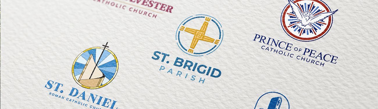
Kristen’s Choice:
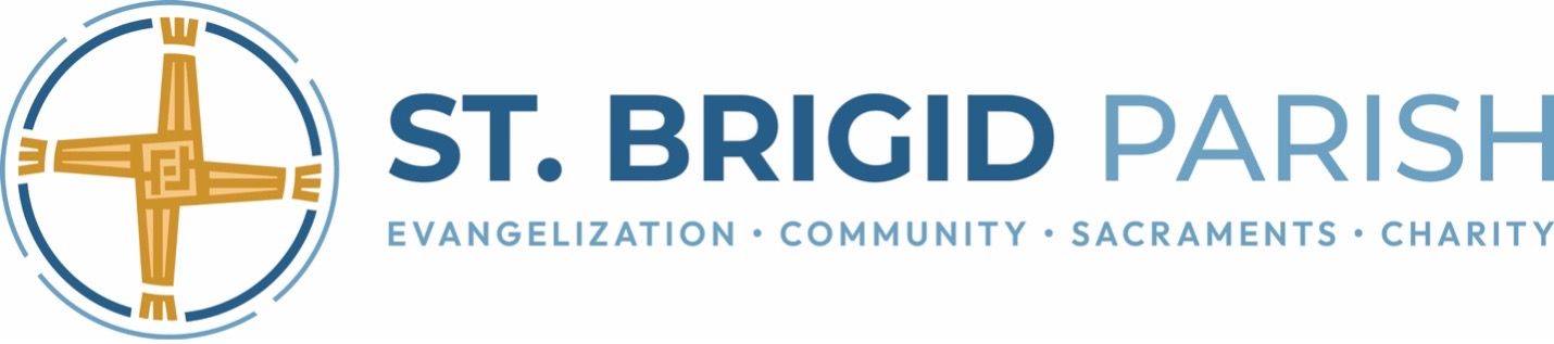
What, in your opinion, makes this a strong logo?
This logo is powerful, creating a distinctive identity that leaves a lasting impression. The inviting wheat gold evokes comfort, while the tranquil lake blue adds calm. Together, these colors enhance the logo's visual appeal and foster a sense of harmony.
What were some of the goals that the parish had going into this design and how did the design satisfy those goals?
The aim of the parish was to unify both church locations under a single brand that did not show preference for one parish over the other. The iconic design of St. Brigid’s woven cross was thoughtfully crafted. The tagline also played a crucial role in the design, and it was divided into four quadrants to symbolize a commitment to their mission.
What do you personally like about this logo and why?
I appreciate this logo for its simplicity and iconic design. The intentional line weight enhances its appeal, while its inspiration from the baptism font symbol connects well. Creating a unique design that effectively represents the church resonates with me in building a brand.
Tim’s Choice:
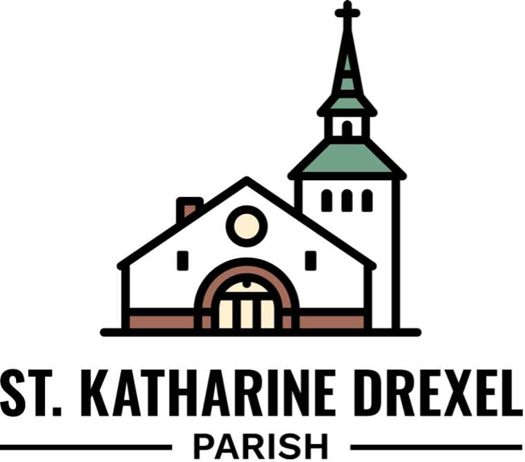
What, in your opinion, makes this a strong logo?
There are many elements that contribute to the strength of this design. I particularly like its simplicity, clarity, and color palette. The use of white for the church structure paired with soft greens and browns emphasizes peace, reverence, and tradition. The logo feels modern due to its minimal and stylized shapes, but still preserves a traditional aesthetic. It’s approachable for all age groups while still reflecting the parish’s heritage.
Overall, this is a strong logo because of its versatility, emotional impact, and the fact that it can function across various platforms and media.
What were some of the goals that the parish had going into this design and how did the design satisfy those goals?
The parish wanted a nature-based, soothing color palette, so we used soft, calming greens and browns that reflect the parish's scenic, natural surroundings near a lake.
The parish also hoped for a welcoming and informal feel. To accomplish this, we created a design with clean lines and intentional simplicity for an informal and relaxed vibe. Wishing to convey their community’s generosity and hospitality, we achieved this by creating a design with a balanced and harmonious layout. It feels open and approachable.
Lastly, they wanted the design to reflect the fact that they are nestled within a summer vacation/retirement destination. The relaxing color scheme and clean design feel appropriate for that setting.
What do you personally like about this logo and why?
What I personally like about the logo is its simplicity combined with meaning. The design successfully mixes a sense of peace with a modern, clean execution, making it both timeless and versatile for a range of applications. Its palette aligns beautifully with the parish's identity as a welcoming, informal, and serene spiritual environment.
--
Like what you see? Browse several other samples of church logos we’ve designed on our website. If your parish is ready for a logo refresh or a complete rebranding, get the process started today!
Dive into more in the "Art and Design" section of our blog.
Updated: 09-24-2025
Share
You might also like
LPi Blog