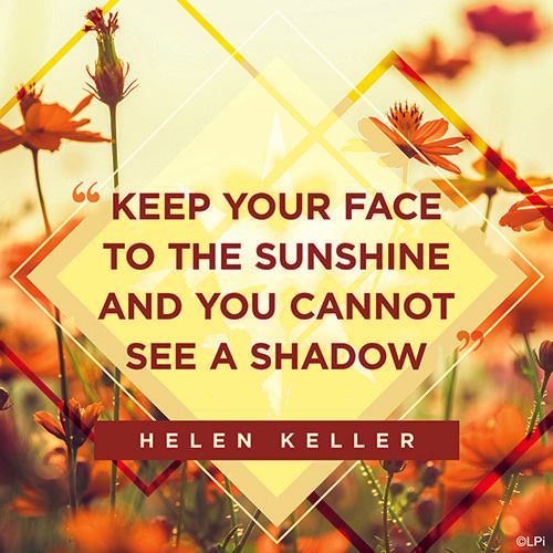
Heidi —
This is one of my favorites of the year because the message is important to me. I wanted to create an image that had as much impact as the message does.

Did you know that there is an entire team of graphic designers behind the thousands of graphics, designs, templates, and more that we release every year? These images are created for you to use in your bulletins, websites, social media posts, flyers, (and any other way you can think of) through our WeCreate collection!
We asked our designers to share about the pieces they most enjoyed making over this past year, collected their responses and examples of the work, and compiled them here so you could get a little behind-the-scenes view of who your LPi design team is and a taste of the passion that they put into their art!
Heidi —
This is one of my favorites of the year because the message is important to me. I wanted to create an image that had as much impact as the message does.
Heidi —
I love the lighting of this piece, and the contrast of the geometric shapes with the organic background is really visually interesting.
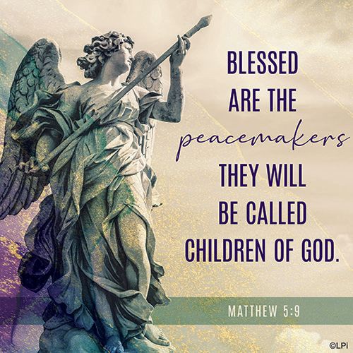
Heidi —
I love the lighting of this piece, and the contrast of the geometric shapes with the organic background is rI’m a big fan of how the overlaying textures and subtle colors turned out in this piece. Sometimes it can be hard to balance text and a strong image because they end up competing instead of working together in a hierarchy, but I think everything balances really well here.eally visually interesting.
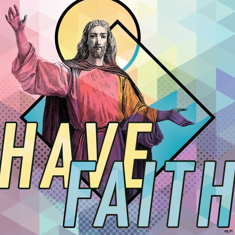
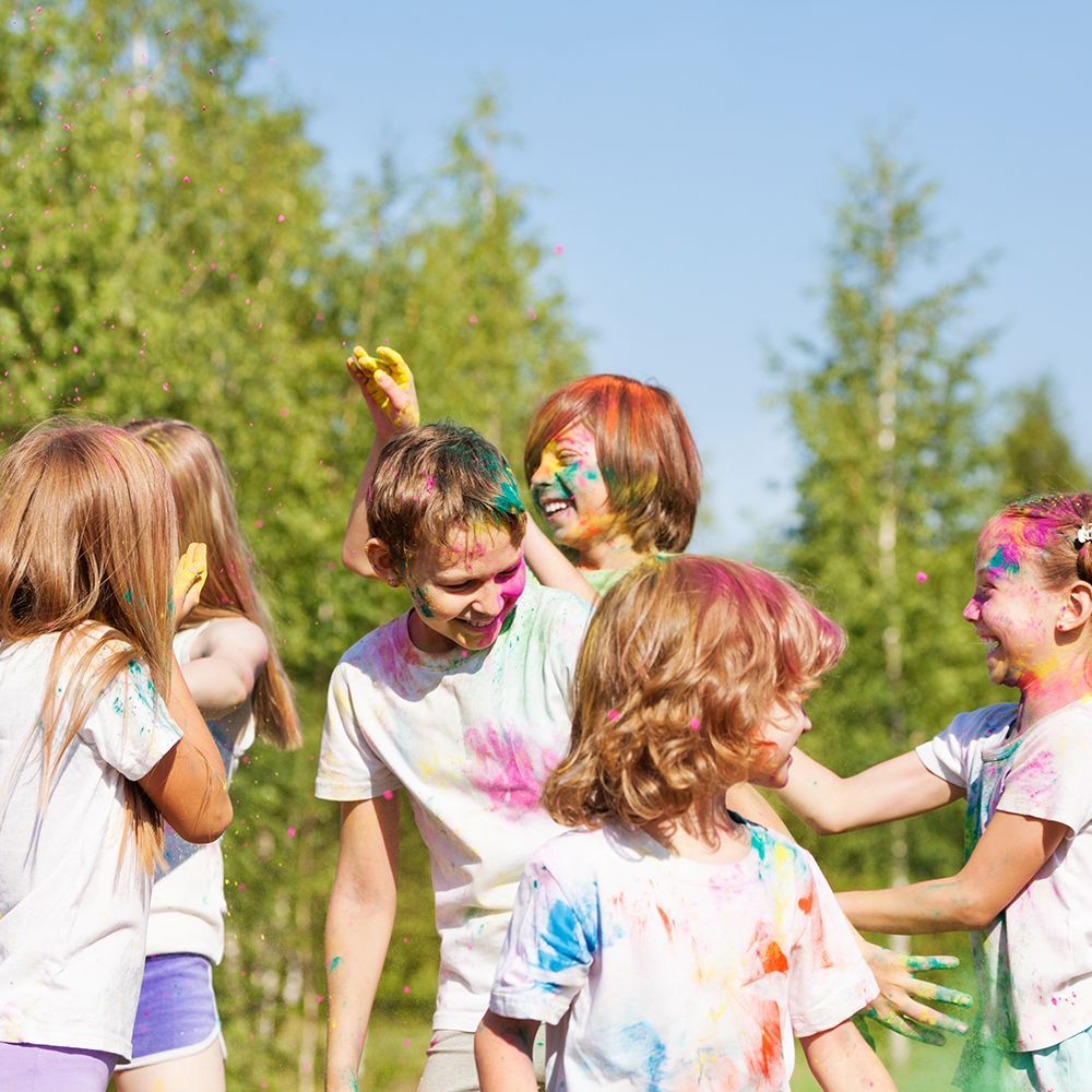
David —
This one was very different than anything we’ve done previously for our Connect! Sunday Reflection blog, so I had fun, took a risk and I think it paid off! It’s vibrant, modern, geometric, and has a playful energy. My goal was to get people excited when they saw this piece! Have fun and have faith!
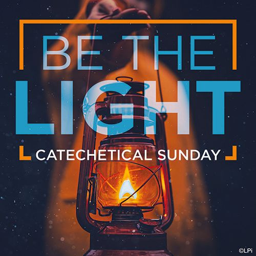
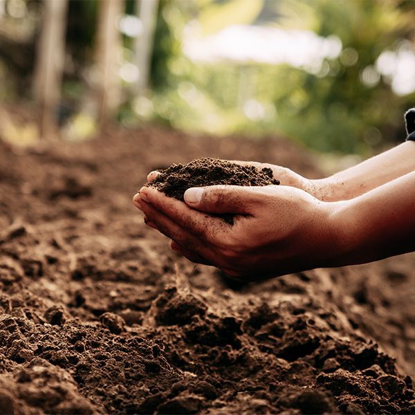
Gaby —
One thing I absolutely love about graphic design is that you often have the freedom to be either very literal with a piece or more abstract in its interpretation. This was one of those very literal pieces that I have done, where the imagery I chose directly correlates to the text. I think that is why the piece turned out so successfully, because by marrying the two elements you give the audience that connection as well. If you’ll notice too, the imagery I chose is rather dark which in turn makes the idea of “light” that much more impactful in the piece, you truly get that feeling of light shining through in the darkness.
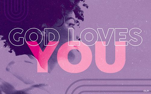
Gaby —
Overall, the Gospel meditation companion pieces are one of my favorite sections of artwork we designers do on a month-to-month basis. I love being able to focus on typography and photography that is more “people-driven” in its nature. This piece is special to me because by focusing on a single person as the subject with nothing in the background you can really start to put yourself into the piece and say, “yes, God loves me” even if you don’t look exactly like that person, the piece implies itself to everyone who is viewing it! I also always try and challenge myself to play with text in every piece I create, how can I change the size of the text, turn it on its side, flip it, etc. I think by stacking the text in this piece on top of each other as well as having part of it be just an outline, it allows for you to see that each line of text holds its own importance, but together the message is even stronger.
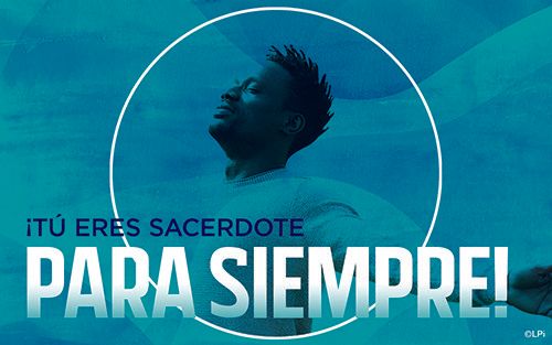
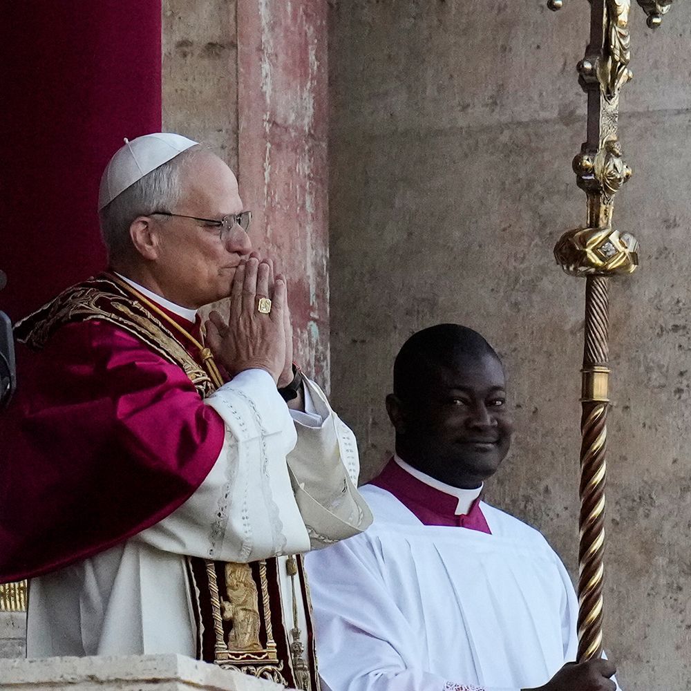
Gaby —
With a lot of my work, I tend to look for inspiration before I even start designing. That often gives me a better sense of the direction of where I want the piece to go, and what feeling I want the piece to give viewers. This idea was inspired by a piece I saw on a catholic design blog called Sunday Social. I was in complete awe of the design and thought to myself, “How can I introduce some of the techniques/styles they are using into our LPi artwork?” This clip’s translation says, “You are priest forever,” so I was thinking about how I could visually show this idea of “forever.” I chose this image of a man cropped within a circular shape, but his arm is breaking out of the bounds of the circle. This is to show that there is something outside of the circle or outside of this “life” that extends forever. Then by adding some depth and feel to the piece with different color tones and textures, I was able to bring the design to life and allow it to tell its story.Overall, the Gospel meditation companion pieces are one of my favorite sections of artwork we designers do on a month-to-month basis. I love being able to focus on typography and photography that is more “people-driven” in its nature. This piece is special to me because by focusing on a single person as the subject with nothing in the background you can really start to put yourself into the piece and say, “yes, God loves me” even if you don’t look exactly like that person, the piece implies itself to everyone who is viewing it! I also always try and challenge myself to play with text in every piece I create, how can I change the size of the text, turn it on its side, flip it, etc. I think by stacking the text in this piece on top of each other as well as having part of it be just an outline, it allows for you to see that each line of text holds its own importance, but together the message is even stronger.
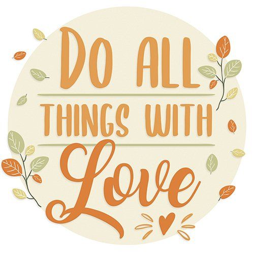
Tim —
Fall is easily my favorite season. To convey the seasonal change in this piece I focused on color, specifically a warm pastel palette. I love the cozy feeling you get from this.
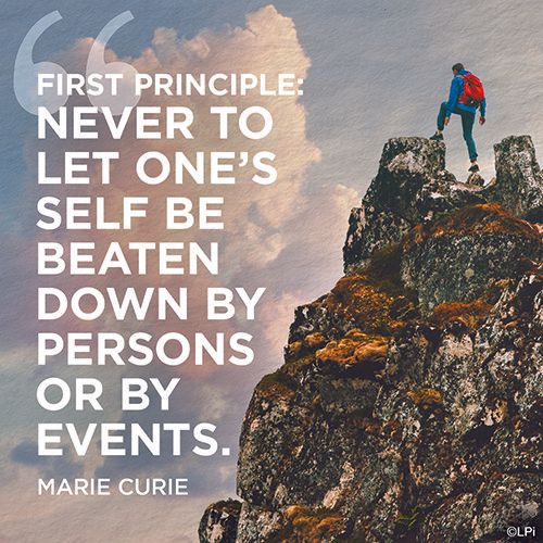
Erich —
The concept for this piece was mainly inspired by the first half of the quote, “Never to let one’s self be beaten down…” I chose an image which would portray someone overcoming something that would be very difficult, the rough rock, unstable ground and the higher elevation. While choosing the image I was looking for one where I could replace the sky background in order to create more of a unique image and have an open space for the quote yet still convey the heights that the person has climbed. The composition is visually balanced yet asymmetrical, which allows for dynamic movement as the typography and mountain shape mirror each other. Overall, I enjoyed this creating this piece of art because the quote speaks to something I hold very true to myself, to not let yourself be influenced by the negativity/judgement or other people or situations, to always be true to who you are.

Erich —
I chose this piece because of the unique typographic solution I was able to achieve in a narrow space while maintaining the emphasis and readability of both words and the overall idea of the art. The image is simplistic yet very emotionally recognizable allowing the viewer will instantly connect with the message conveyed by the art.he concept for this piece was mainly inspired by the first half of the quote, “Never to let one’s self be beaten down…” I chose an image which would portray someone overcoming something that would be very difficult, the rough rock, unstable ground and the higher elevation. While choosing the image I was looking for one where I could replace the sky background in order to create more of a unique image and have an open space for the quote yet still convey the heights that the person has climbed. The composition is visually balanced yet asymmetrical, which allows for dynamic movement as the typography and mountain shape mirror each other. Overall, I enjoyed this creating this piece of art because the quote speaks to something I hold very true to myself, to not let yourself be influenced by the negativity/judgement or other people or situations, to always be true to who you are.
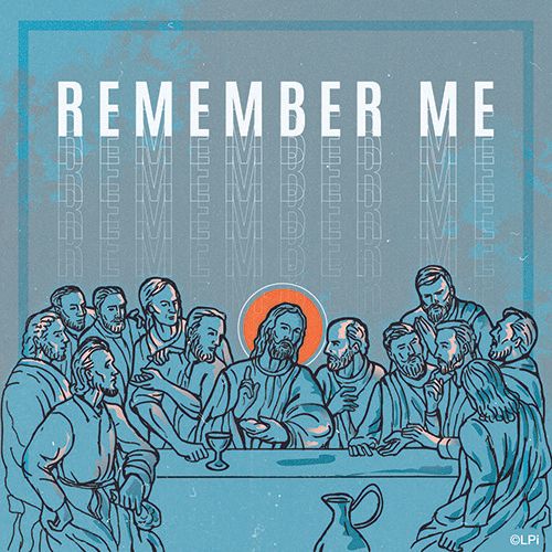
Kristen —
“Do this in remembrance of me.” Luke 22:19 Last Supper, Communion imagery. I love this art graphic in particular for the more modern approach to such an iconic statement and imagery of the Last Supper painted by Leonardo da Vinci. Simplifying the focus with the colors to show Jesus with a opposite color halo and then having each disciple’s face reflect that light. This ended up being one of my favorite things about this graphic.
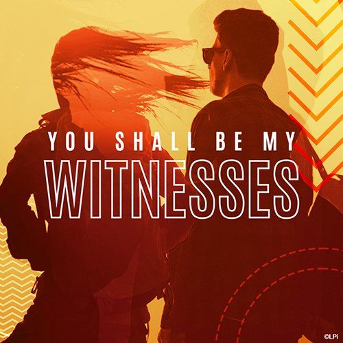
Kristen —
“Go out and make disciples of all nations.” Everyone is called to be a witness. In this image, created for social media use, I wanted to speak more to a crowd who don’t necessarily think they identify as the “typical witness” in a modern design approach with colors you would find associated with the Holy Spirit and Pentecost Sunday.

Kristen —
A Good Friday message, God’s plan for us was his Son, this social media banner focus solely on the message of “Unfailing Love” in a modern design. Each of my favorite pieces that I have designed this year speaks to that more modern aesthetic. I connect more with messages in that style, and I think younger parishioners connect to it as well. While I do design Catholic pieces in other styles this modern approach is what resonates with me.
If you want access to all of these graphics along with the thousands of others we have available, make sure you are subscribed to our WeCreate library . If LPi already partners with your Catholic parish and prints your bulletin , you are already subscribed and have unlimited access to WeCreate! Our customer support team is always ready to assist you so if you need help accessing these tools you can contact them here .
Updated on 10-25-2025