The Best Catholic Church Website Examples — Peep for Inspiration!
Your parish website matters! It’s a direct extension of your culture, your message, and your mission. Our design team has worked with parishes across the nation to build websites for church communities from scratch and complete website redesigns that run the gambit from elaborate to small tweaks. Our website builder,
WeConnect, makes it easy for parish staff to create and maintain amazing church websites and we love being a part of the process. This week we picked three sites to show off. We hope you find some inspiration for your own parish’s website in the following designs.
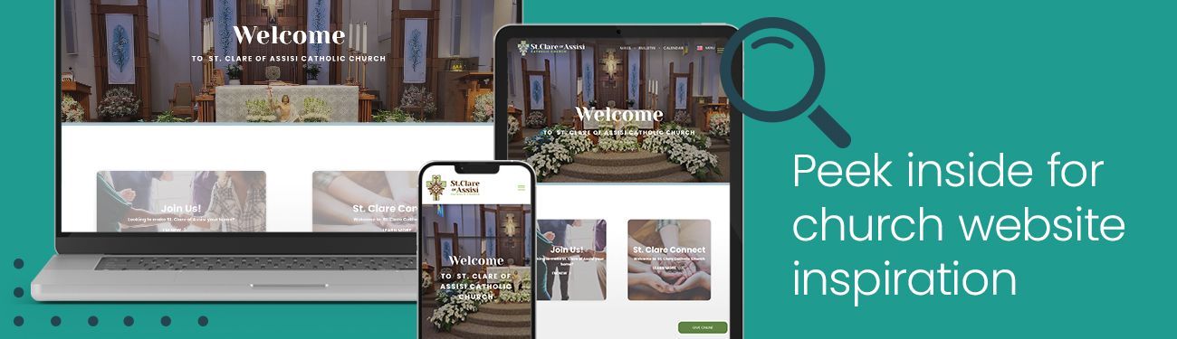
Website Winner With the Best Use of Color
St. Clare of Assisi Parish Website
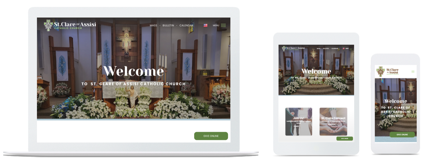
What we love about it:
- We love the vibrant color pops throughout. The pairing of green, pale blue, and brown isn't a color combination that we normally see, and it works beautifully here.
- There is lovely photography throughout the site giving it a more professional and polished look while still being completely personal to the church and inviting to visitors.
- The use of a
serif (more decorative) font paired with a sans serif font, ties the
new logo and branding seamlessly into the site while making everything super legible and elegant at the same time.
- The subtle but extremely effective usage of animations while scrolling.
- We love how everything about this site is super bold and clean. The use of large bold typography adds to the design, specifically utilizing black type to ensure the legibility of the homepage.
Website With the Cleanest Layout
St. Martin de Porres Parish Website
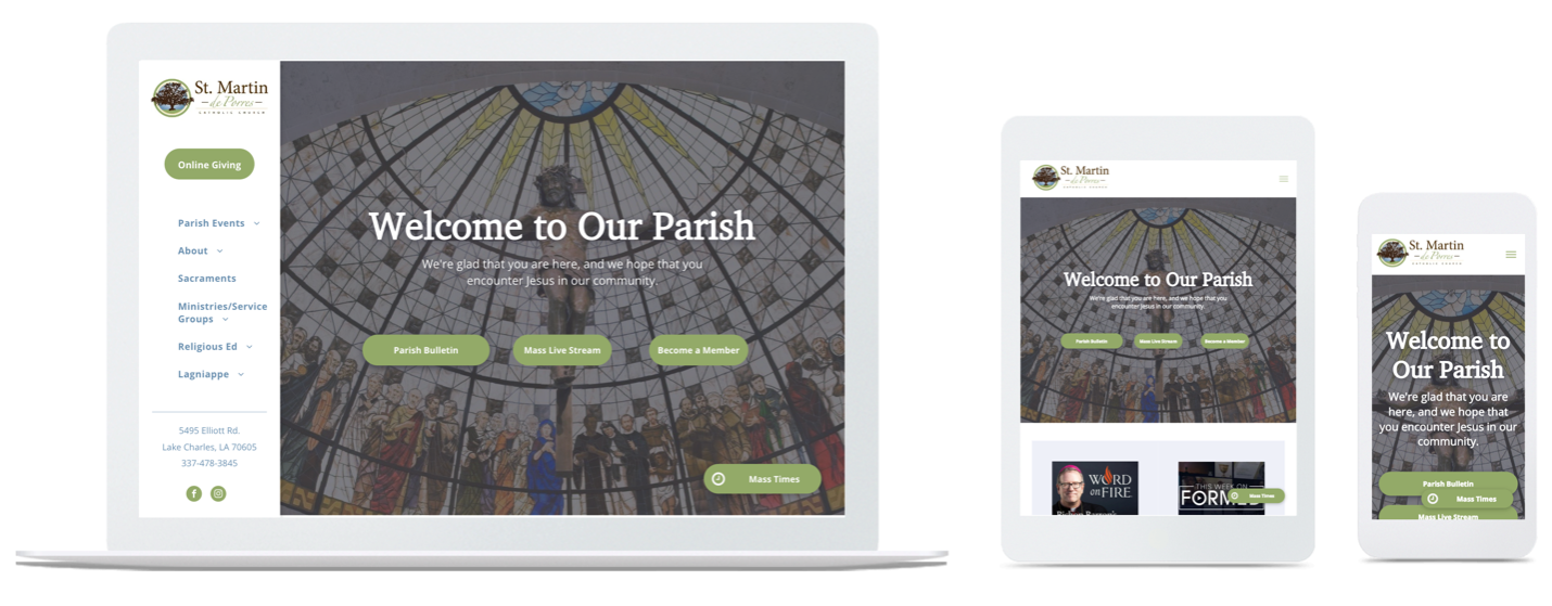
What we love about it:
- This is a nice example of how clean sidebar navigation can be useful for a church website, especially since it never disappears when scrolling. This means it’s always accessible to those visiting the website.
- This design is a great example of how sometimes "less is more." There isn't a ton of content crowding the homepage which is part of the reason it is a very successful design.
- The space in this site is filled without feeling overwhelming. There is no excess or unnecessary space.
- This site’s navigation is organized well. For example, it’s easy to access the Mass times, the digitized weekly bulletin, the parish’s livestreaming links, and information on how to become a member.
- The site does a good job of mixing two different typefaces. These are used in consistent sections to maintain readability across whole site.
Website Winner For Most Consistent Color Palette
St. Olaf Catholic Church Website
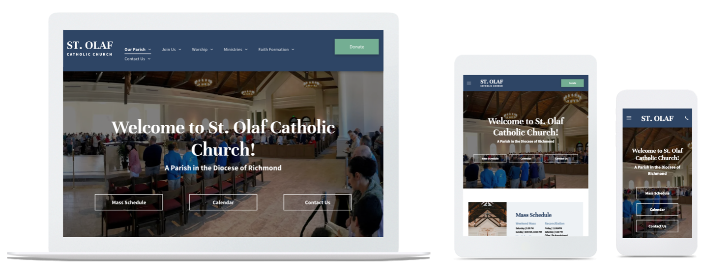
What we love about it:
- We love the contrasting and consistent color palette for emphasizing important information and links.
- There is no unnecessary filler space or information. Everything on the subpages is concise and relevant to the page topic.
- The pages are balanced with positive and negative space. There is enough breathing room so that information doesn't get jumbled and smashed together but there’s also not too much spacing — something that can cause the information to feel minimal or disconnected. The balance is on point.
- There is the perfect amount photography used throughout the site to break up text information with inviting images of the community.
- This site incorporates smart choices when it comes to the color combinations — especially introducing tints of the main colors in the palette really gives the site the proper hierarchy it needs to guide the audience through each of the pages.
- This site is a great example of utilizing a clean typography pairing when the church doesn’t have a specific logo yet.
- A simple and organized footer gives the homepage a clear end.
---
Like what you see? If your parish needs help dialing in your web presence or simply wants a brand-new look, our web design team is the best of the best! Or simply start small with a new or refreshed parish logo to give your community the identity it deserves!
For more articles about parish websites, visit the "Web and Social Media" section of our blog or dive into our free comprehensive guide on how to build a Catholic church website!
Updated on 11-04-2025
Share
You might also like
LPi Blog