Before & After of a Catholic Bulletin and Brand/Logo Redesign
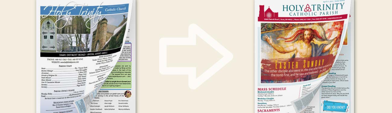
LPi’s graphic design team often tackles the task of refreshing our Catholic parish partner's complete branding. The designers’ thorough process includes interviewing the Catholic church who is redoing their logo, working through several drafts of potential designs, and providing a beautiful, updated brand to the community. The LPi portfolio for these rebrands includes pieces like letterhead, bulletins, logos, and more. One of the most recent pieces is this bulletin facelift by LPi designer David, graduate of the University of Wisconsin-Milwaukee, and a designer for LPi for the past three years.
David and his team were sent this bulletin (pictured above) from Holy Trinity Catholic Parish in Avon, Ohio, and they went right to work. David was kind enough to answer some questions about the process and to reveal a some of his design recommendations for every parish.
Q. What were the most important elements of the parish that you wanted to highlight in the redesign?
A.
Once we receive the questionnaire back from the parish regarding their priorities and preferences, I decide what’s important to this church and what’s important to my design choices. A few things that stuck out to me about Holy Trinity Parish were: (1) they wanted to stay close to the cover style they were already using (2) there is historic value at this parish and (3) design-wise, the logo is an outline.
I was able to give them a fresh masthead that kind of repurposed their existing logo, which was a tracing of their church building. I think the masthead works really well for the bulletin cover, bulletin covers are often a first impression piece. Sometimes we try to put too much on the cover, so this was about trying to find the balance between the information they wanted available while keeping the style clean and not too overwhelming.
Q. What are your favorite improvements to this piece?
A.
I think one of my favorite parts was the masthead section. When we started, the parish had a lot of information on the front page, and they wanted to keep that information intact. So, I took the imagery of the church and condensed it into a modern, clean graphic that was able to incorporate the contact information bar.
In addition to that, we were able to provide Holy Trinity Parish with a style guide, which is a design outline tool that encourages sticking to 2-3 fonts and no more than 4 colors, all of these decided through parish consultation and designer-recommendations.
I believe we were able to obtain a clean, modern take while respecting the balance between traditional and modern elements. The traditional look was important to Holy Trinity, due to the historic nature of the parish.
Q. What made you proud to work with this parish?
A.
I think that this design spotlights the integrity of the history and tradition of this particular location in a fresh, modern way. I feel like we didn’t need to sacrifice anything, and we found a great balance of image and text. This makes for a more engaging design.
Q. What tweaks can any parish do that could create a “facelift” to their bulletin almost instantly?
A.
Honestly, if you are limited and can only change a handful of things, make yourself a style guide, and then stay consistent.
Select two to three fonts for your entire bulletin
Same with colors, select up to 4 colors, and then stick with those throughout your entire piece
Consistency is huge, and you’ll see a huge difference. Keep your design clean and easy-to-read for your parishioners and any visitors reading your bulletin.
Q. What are some design pitfalls that you sometimes see in bulletins?
A.
The two biggest would be:
1.
Text boxes with borders around every piece of text. It’s common, and I can see why it’s tempting because you want to separate the content. But with a clean layout, text boxes are not necessary. Use a colored text box to call out events or special things.
2. Reading straight across an 8.5×11 page is tough on the eyes. I think that a lot of bulletins use the two-column design that could be broken into a three-column which is more visually interesting and helps a reader navigate more easily through the page.
Q. Why do you think that good design matters in communication?
A.
I think that good design gives people an important first impression of your parish and, as a communication tool, good design helps ensure that the reader receives the messaging. How do you want your parishioners to feel as they’re reading? Good design can help push that message.
LPi’s Graphic Design team is honored to work alongside Catholic churches like Holy Trinity to bring the Good News to local communities across the United States. Have some questions about what the redesign process could look like for your parish or want to check out some more before-and-after images of other bulletins we've redesigned for parishes? Head over to www.4lpi.com/church-bulletins to learn more about our bulletin services or dive into our free comprehensive guide to publishing parish bulletins.
Happy publishing!
Updated on 6-25-2025
Share
You might also like
LPi Blog