4 Common Church Logo Mistakes and How to Avoid Them
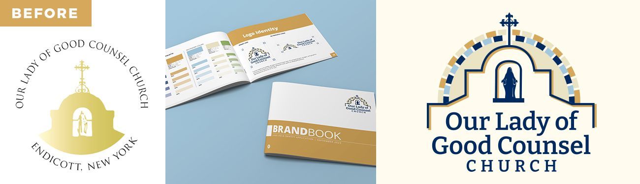
So, you’re considering redoing your parish’s logo or, maybe you’ve never had an official church logo and your community is ready for a design all your own. Whatever camp you’re in, we’ve collected the top four mistakes our parish logo designers frequently run into when working with parishes on the new logo design process.
Avoid these common mistakes to make your new church logo the best that it can be!
Church Logo Mistake: Trying to Incorporate too many elements.
Often communities want to incorporate lots of distinguishing elements into their logos all at once. We have encountered parishes who want their logo to include their patron saint, their building outline, a cross, a dove, their church name, church location, and church tagline, with a brilliant sunset in the background, all in the same logo.
Although it is important to consider including one or two of your community’s distinguishing elements into your design, having too many design components will lower the effectiveness of your logo. Your parish logo should be simple enough to be recognizable from a distance as well as uncomplicated enough to be able to still look nice when printed on a small item like a business card or a parish gift like a mug. Having a logo packed with too many elements (and words) can also confuse first time viewers and, in fact, busy designs are known to actively discourage viewers from looking at them.
Best Practice: Consider choosing just one or two elements to include into your design along with your church name.
Church Logo Mistake: Using clipart.
Clipart may have been new and novel 25 years ago but, these days, the use of basic clipart-like designs inside a parish’s logo unfortunately gives off the impression that the parish is outdated or simply doesn’t care about how it represents itself to the world. This can discourage newcomers, especially from the middle aged and younger generations, who are accustomed to seeing professional logos used for everything — their sports clubs, schools, online communities, and even their friend groups and one-off special events — from considering your parish as their new home.
If your parish is still using a logo with a piece of clipart alongside your parish’s name, it’s time for an upgrade! Not sure where to start?
We have the new church logo design process down to a science and can help!
Best Practice: Use a graphic design professional to create a church logo that is as vibrant and awesome as your community is!
Church Logo Mistake: Making the font too complex or too small.
Sometimes church communities fall in love with different fonts that might not be the wisest choice for inside their logo. Having a complex font or too many different fonts inside one logo can make it difficult for people to digest your logo as a whole. Consider that all ages and all abilities will need to be able to read your logo easily and clearly. This goes double for any
logos that include a tagline. Using very complex, swirly, cursive, tiny, or poorly spaced letters can cause confusion.
It’s a great idea to test out the readability of different font ideas for your logo with a variety of people at your parish before making your final decision.
Best Practice: Choose just one or two fonts to communicate your parish’s name and tagline if you are incorporating one. Make sure the font is clear and easy to read both from a distance and when printed small on a business card.
Church Logo Mistake: Using too many colors.
Human beings naturally start to feel anxious when encountering too many colors at once inside a design. To avoid this common mistake,
our team can help walk you through the process of intentionally choosing the best colors for your community! If you aren’t going with a professional designer to create your new logo, however, consider what colors might be important to your community, which colors best represent your parish values, or how you would want someone to feel when they see your logo.
In fact, we recently wrote an entire article on the concept of color theory when designing for your parish to help you with this process —
take a look! Don’t forget that your logo may frequently get printed in black and white so designing your colors with a black and white logo variation in mind is important!
Best Practice: Choose only two or three complimentary colors for your logo that best represents your community.
---
Need some inspiration? We have samples of fantastic church logos on our website as well as a free everything-you-need-to-know guide for designing the very best parish brands and logos and number of articles about church branding on the Art & Design section of our blog.
Happy designing!
Updated 11-05-2025
Share
You might also like
LPi Blog