Our Designers' Favorite Catholic Church Logos!
Did you know that our design team typically receives two main types of requests when it comes to designing Catholic church logos? Most frequently, parishes want their logo to focus on their patron saint or on an element of their church building’s unique architecture.
Every year, our amazing team of designers meets these requests and more for parishes all over the country. It’s our pleasure to work with parish communities to bring their
brands and logos to life, and we’re proud to share four of our favorite Catholic church logo and branding projects to date.
Marian-Inspired Catholic Church Logo, Our Lady of the Lake Church and School
This logo is strong because it creates harmony between their parish and their Catholic school. The community wanted to use elements from their existing school crest (the gold cross and blue colors), combined with elements from the parish, like the image of Mary.
Mary, often depicted as a key figure in many Catholic church names, serves in this case as a familiar image reference that our design team frequently works with. The most effective “saint-featured” logos maintain a clean aesthetic by simplifying colors. When choosing the colors for saint-featured logos, we also evaluate the design’s effectiveness in many different capacities. For example, does the logo look good in black and white? Does it look good as a social media icon or as a watermark? Our goal is to make sure the figure fits in all contexts without becoming unrecognizable or unsettling.
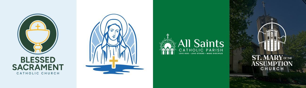
Iconic Catholic Church Logo, Blessed Sacrament Catholic Church
The Blessed Sacrament logo is an “iconic-styled” logo. It combines both bold typography and symbols that reflect the Body and Blood of Christ in the Eucharist.
An effective iconic logo like this should be easily recognized at a glance. It should be so bold and simple that anyone could easily re-draw it from memory. This logo adheres to that principle. As for the color choices, the use of green, gold, and blue accents creates a harmonious and cohesive color palette for the parish’s identity.
Symbolic Parish Logo, All Saints Catholic Parish
This parish came to us with a vision! They hoped to have a logo and brand design that reflects the communion of saints and their parish’s unique tagline, while also using recognizable liturgical colors.
The finished logo exudes a welcoming feeling using jewel tones influenced by the colors of the liturgical calendar. Its uniqueness and clarity make it a compelling design. If you look closely, you can easily identify a golden monstrance, three figures with tongues of fire above them (like those encountering the Holy Spirit at Pentecost), a cross, the Eucharist, and the viewer can even interpret this logo as depicting the Trinity.
Although this design is clearly multifaceted and communicates a lot, it is still simple and elegant enough to be scaled to any size and still look great. It’s memorable, unique, and the type of design that a parish can be proud of!
Architecture-Inspired Church Logo, St. Mary of the Assumption Church
This parish logo highlights the unique architectural elements found in St. Mary of the Assumption’s sanctuary building, combined with an illustrative design style. Community members who see this logo will immediately recognize the architecture and know who this logo belongs to. It’s easy to see why designs like this stand out among some of the
best parish logos.
What we particularly admire about this design is its presentation of the church's façade within a circular golden “frame.” The frame calls to mind the halos found in traditional Catholic icons of saintly figures and immediately bridges the gap between design and holiness for the viewer — it’s a nice touch!
As for the other color choices, the gentle blues symbolize Mary, while the warm tans and bronzy-gold colors reflect the stone and bells of their actual church building.
Start Your Catholic Church Logo Design
Love these examples and want a beautiful new logo for your own parish? You’re in luck because
we’re here to guide you every step of the way! Whether it’s time for a fresh start or a complete rebranding, LPi’s experienced designers are ready to help your parish stand out and connect with your community. Your story is worth celebrating — let’s create something extraordinary together!
For a more comprehensive guide to branding beyond simply logo design, head over to our article,
Parish Branding Made Simple: A Guide to Logos, Identity, and Mission-Driven Catholic Brand Design
Updated April 30, 2026
Share
You might also like
LPi Blog