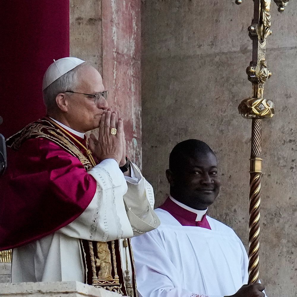
Successful Church Logos We Loved Making and Why
One of our favorite tasks at LPi is creating church logos and branding! Whether a parish is simply updating an old logo or diving into a completely new design, our team of designers is there to guide them until their new brand is perfect.
We had an opportunity to interview a few of our designers about the logos they’ve created for parishes that they consider to be their favorite designs. Before we reveal these strong church logo designs and explain why each one is so successful, let’s quickly review what makes a strong parish logo.
What Makes a Strong Church Logo
Your parish logo should represent your unique community at a glance. Here’s what parishes should consider when creating a new logo/brand.
- A good composition that can be recognized at a large or small scale. It should be easily read and recognized from far away and up close.
- Strong brand recognition. If there’s another church down the road with a very similar logo, it can confuse the community and parishioners.
- Colors that represent the “feel” and “atmosphere” of the church, so if the church is more traditional or more modern, the style of the logo and the colors used should be a direct representation of that.
- A timeless design. Choosing a logo that is too “trendy” can be an issue when, a few years down the road, it may end up looking off-trend or outdated.
- Intentional design elements. Selecting a logo that is too complicated or includes too many elements can also make it hard to read and remember.
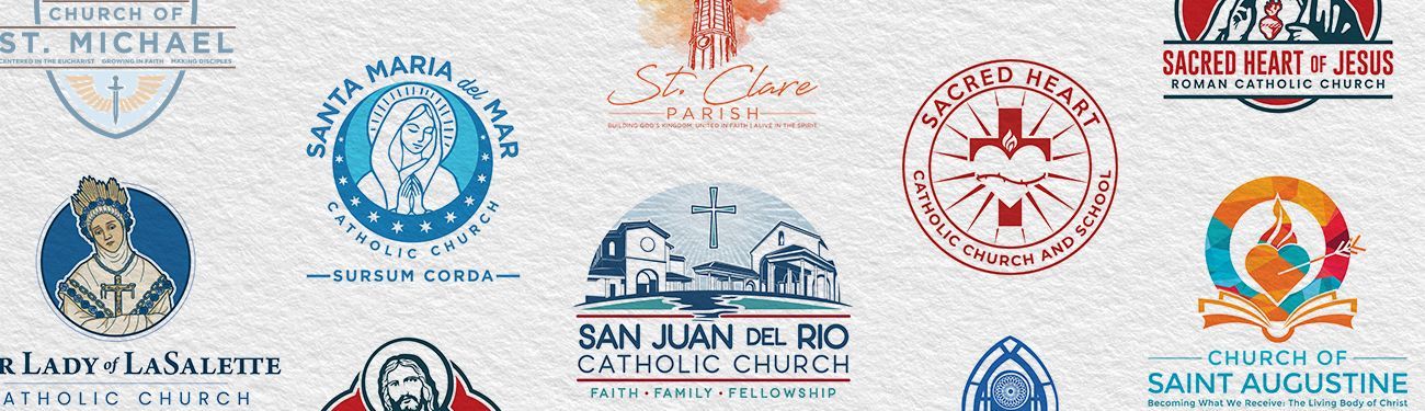
3 Examples of Excellent Catholic Church Logo Designs
Now, on to the logos that our designers chose to highlight! Three members of our design team chose a logo that they created and kindly answered a few questions about why that particular logo is a strong design.
Heidi’s Favorite Marian Church Logo
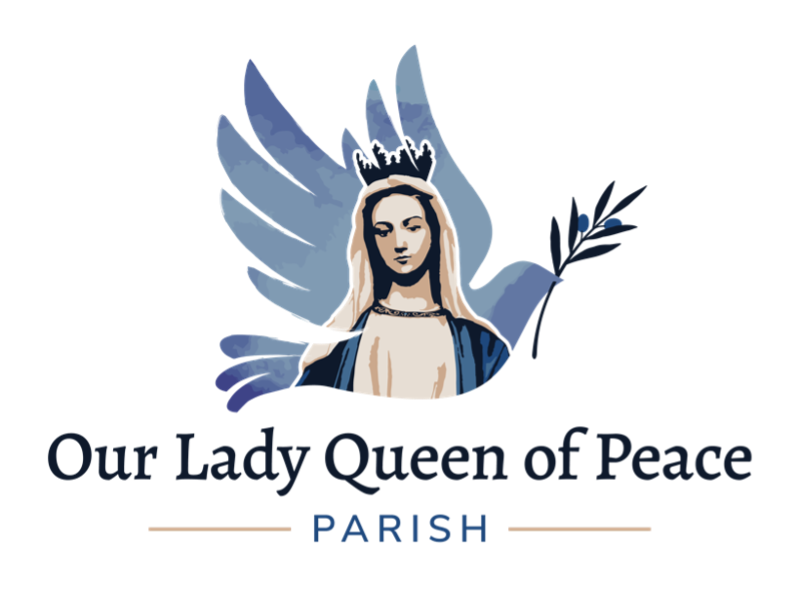
What, in your opinion, makes this a strong logo?
This logo is strong for a few reasons. One is because it’s fully customized. You’re very unlikely to see another logo that is similar in the same region that Our Lady Queen of Peace is in or even beyond. Because of this, the logo is also more likely to be memorable and helps to create brand recognition and loyalty for the parish. Another thing that makes it a strong logo is that its design is simplistic enough to be easily understood from a distance.
Going into this design, what were some of the hopes and goals of the church, and how did the design satisfy those goals?
The parish wanted to use Marian imagery and the university’s colors in their design. The idea was that this would help tie their two church communities and their educational campus together. They also wanted to represent peace using the image of a dove and/or olive branch. As you can see, we were able to include all these requests in the final design!
What do you personally like about this logo?
I like how, when a viewer looks at the logo from far away, they immediately see a dove, but when they look at it up close, they see more — Mary, the crown, and the olive branch. This makes the logo unique and interesting. I also love the soft, calming color palette that complements the subject well.
Evan’s Favorite Architecture-Inspired Church Logo
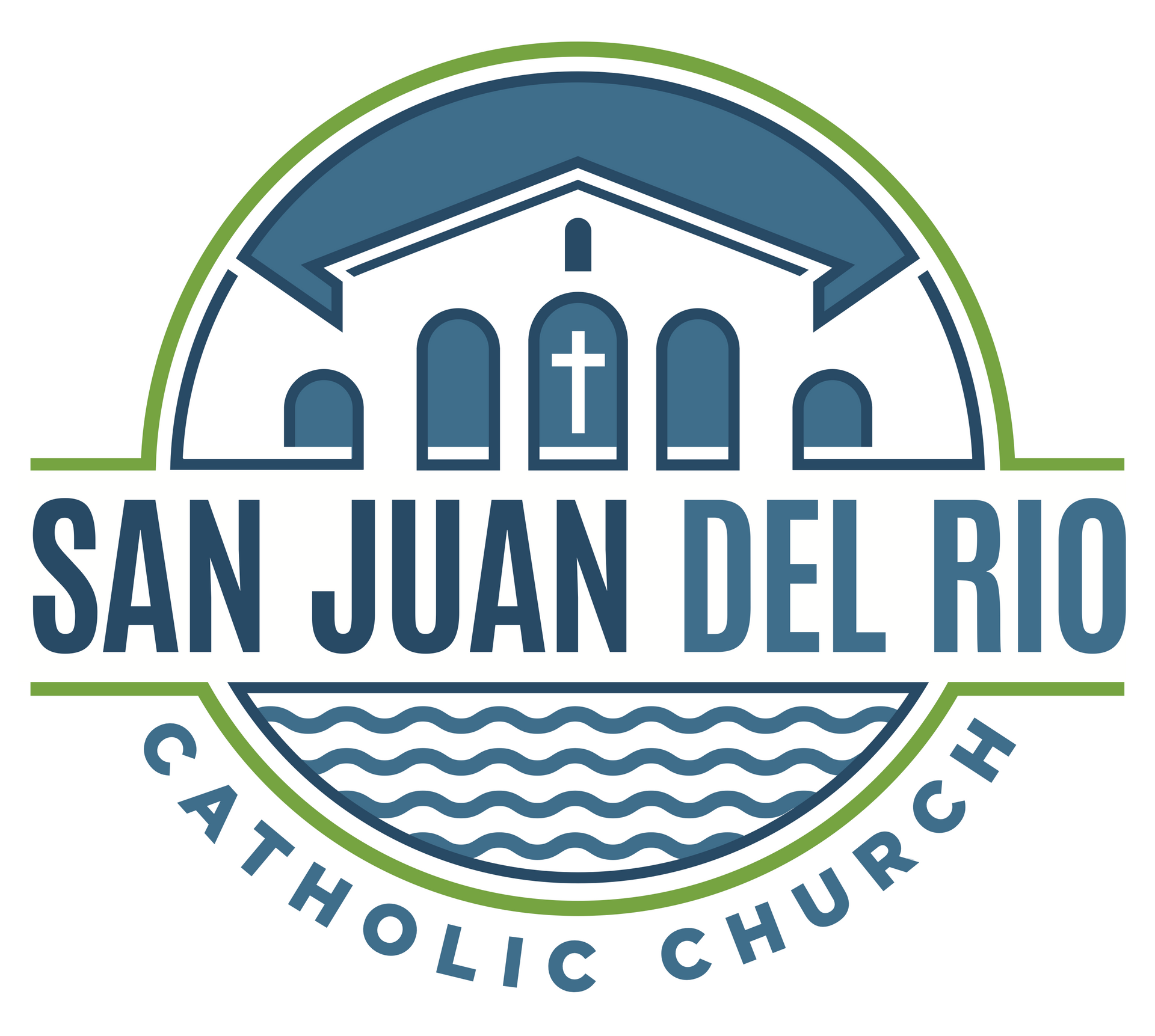
What, in your opinion, makes this a strong logo?
This is a strong logo because of its unique use of negative space and the way the primary text is integrated into it. It incorporates a water element, which balances the upper portion featuring the church. The two shades of blue are contrasted with a fresh green, bringing together an engaging palette and feel for the parish.
Going into this design, what were some of the hopes and goals of the church, and how did the design satisfy those goals?
The folks at San Juan Del Rio wanted to incorporate a river into the logo, so I included that in the design. The parish also wanted their logo to feel welcoming. One of the most welcoming colors psychologically is green, so I went with a friendly green that naturally balanced out the blue hues.
What do you personally like about this logo?
When working on this logo, I wanted all the line work inside the image to create movement throughout the logo, which I believe was accomplished quite well. I also enjoy the modern colors. They are unique, and I think they create a sense of excitement!
H3: Gaby’s Favorite Saint-Inspired Church Logo
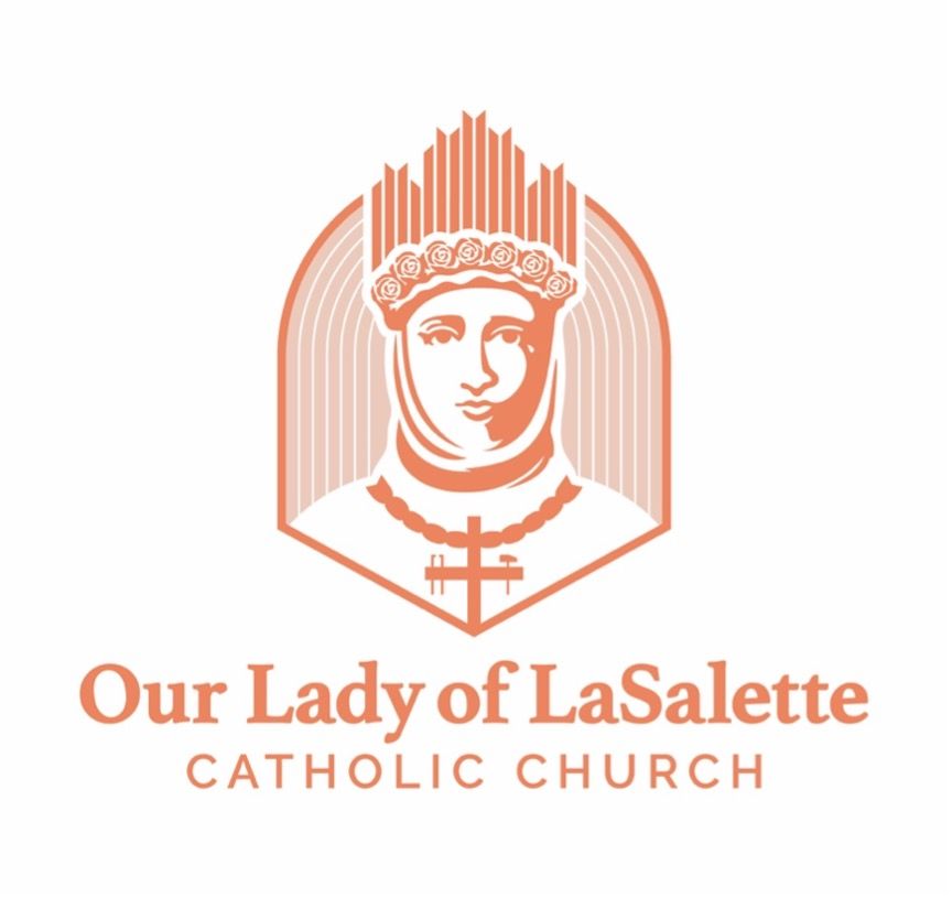
What, in your opinion, makes this a strong logo?
I think the overall simplicity of the logo is what makes it so strong! It can be difficult for a designer to illustrate a religious figure, especially when it comes to the saints. We often get paintings or stained-glass images as references that are complex and busy. We must make sure to capture their likeness in our design as well as include any small details that are often associated with that figure, which can be challenging. For example, they might be seen with a flower, or a certain type of crucifix, and those elements are often hard to pull off at such a small scale. For this reason, I think that this logo was a success — not only because it’s recognizable as the figure, but because it’s so simple and iconic that a viewer is able to point out what each element is and the purpose each serves for the whole design!
Going into this design, what were some of the hopes and goals of the church, and how did the design satisfy those goals?
For this branding, the customer specifically requested that the logo be done in an illustrative style of design. They wanted the logo to include the figure of Our Lady of LaSalette, as well as the hammer and pincers associated with the crucifixion of Jesus on the cross. I satisfied their wishes by having the sole focus of the logo be a zoomed-in version of Our Lady of LaSalette’s face. By taking an up-close approach to the design, I was able to fit in all the details that make her recognizable: her crown with roses, the single tear running down her face, and her crucifix that she wears around her neck with the hammer and pincers. None of this could have been achieved if I had chosen to illustrate her whole body instead.
What do you personally like about this logo?
I think this logo is one of my strongest so far. Fun fact about this one — I had originally started with a completely different design, hated it, asked a fellow coworker for some advice, then started over from scratch. My favorite thing about this logo was the process. Seeing where it started and where it ended was very rewarding for me — especially since I don’t consider this illustrative style my strongest. I decided to take this challenge head-on! Typically, iconic logos are my favorite to design, so it was fun combining the illustrative and iconic styles into one piece. I also chose to only use one color for this logo to push the simplicity even further, and I’m very pleased with how it turned out.
If your parish is ready for a logo refresh or a complete rebranding, you can learn more and get the process started with this brochure or read our recent free guide with everything you need to know about parish branding.
Want to learn more about logos and branding for parishes? Dive into the "Art and Design" section of our blog!
Updated on 04-22-2026
Share
You might also like
LPi Blog