How One Catholic Parish Designed Their Perfect Logo
Our multimedia design team tackles branding projects for parishes all over the country and this week we are sharing an inside look into the creative process behind the design of a new parish logo.
When a church begins the process for a new logo or a brand refresh, our team meets with them to discuss their hopes and desires for their new design. Parish staff also fill out a branding questionnaire that helps prompt them with ideas about what they might want to include. Once this information gathering stage is complete, our designers each work on an individual logo as an option for the parish then present these options to parish staff. Here we share three of the initial logo options our team created for St. Clare of Assisi parish in Canyon Country, California alongside comments about each design from the artist who created it. We will also share the final design!
3 Catholic Logo Ideas St. Clare of Assisi Church
Logo Version 1: Designed by Erich
How did your design satisfy the customer’s ideas?
Within the branding questionnaire, the customer requested to see a logo option that included a rendering of St. Clare. I chose to pursue this request because the church described itself as welcoming and friendly. People can more easily identify with a person, which can help to create a welcoming and friendly atmosphere.
What were some of the design decisions you made?
The most important aspect of rendering a figure is expression. For St. Clare, I searched through many reference images, trying to find the one that had the best expression that would fit into the parish atmosphere: welcoming and friendly. The figure I chose for St. Clare was one of softness and calm — all of which reinforce the welcoming and friendly spirit of the community.
As for the typeface, I wanted to use something bold but also something that had some thick/thin contrast to the strokes of the letters in order to complement the line variation within the rendering. It was also important for the typeface to have a little personality since the main icon of the logo focuses so much on communicating that.
What did you personally like about your design?
The face of St. Clare was key to the success of the logo. The face has a minimal amount of detail yet still captures the soft and calming expression of St. Clare. When portraying an illustrated figure, the face is everything. It's what helps a person identify with and care about another person. Another important aspect of the logo is its visual flow, encouraging continual engagement. As people often look at a face first, the logo features St. Clare's eyes pointing down, leading the viewer's eye down to the pyx, which then leads to the left arm of St. Clare which is gently pointing down to the name of the church. As the viewer's eye gets to the end of reading the text, the pop of green and the contour of the background shape leads the eye back to the top of the logo and back to St. Clare's face and eyes, beginning the process over again.
Logo Version 2: Designed by Tim
How did your design satisfy the customer’s ideas?
The customer requested that the focal point of the logo be the
San Damiano Cross. Other elements they mentioned that they wanted to include were rue herbs and lilies.
What were some of the design decisions you made?
Working with this specific cross can be tricky because of its very distinct, recognizable shape and all of the harsh geometric corners it has. I chose to pair the cross with the rue and, to do that, I had to match the design style of both elements. The challenge for me was finding a way to make the cross feel “softer” but still look like the staple San Damiano Cross. That’s how the design took shape — I merged the rue stems with the cross and made sure to keep the same line-work throughout. I also decided to go with a softer color pallet to pair with the soft edges.
What did you personally like about your design?
I liked that I found a new, unique way to display the San Damiano cross outside of the traditional way that most people see or experience it.
Logo Version 3: Designed by Kristen
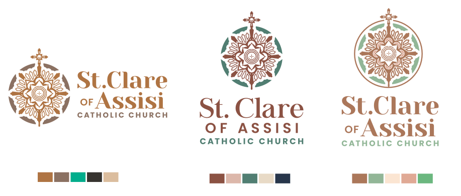
How did your design satisfy the customer’s ideas?
St. Claire of Assisi had a couple of different suggestions for what they were hoping for with their new logo and identity. The element I wanted to capture was the use of a monstrance in an illustrative style design. Illustrative logos, I think, can capture different elements like the tone and the message you want to communicate in the design. With illustrative logos, there is more freedom with design and less rules when it comes to the creation of the logo.
What were some of the design decisions you made?
The church had wanted the design to be fresh, clean, and for the colors to be unique. As far as the colors go, we don’t usually receive requests like theirs for warm browns with a pop of green. I think these colors stand out from other Churches that more frequently request blues. Blue is a nice color to use but it is a color that everyone is comfortable with — it’s safe.
What did you personally like about your design?
I love the presentation of this logo because the roots of the design are traditional, with a serif font and the symmetry of the logo, but it has contemporary elements when it comes to the color, and a serif font paired with a sanserif font for the words “of” and “Catholic Church.”
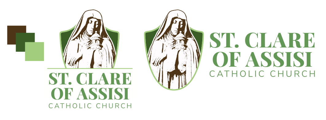
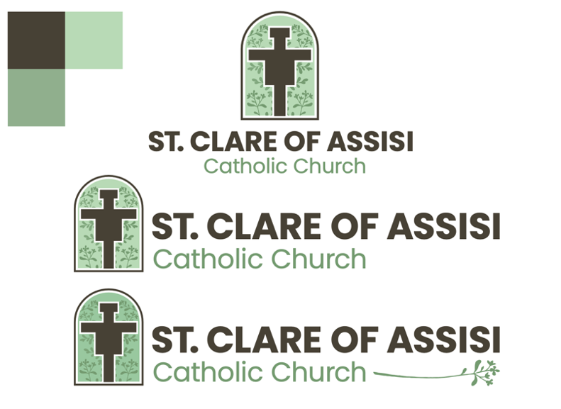
The Final St. Clare Logo Reveal
So, which of the three logo options did the staff of St. Clare decide to go with and develop into their final branding? In this case, the parish actually decided to incorporate elements of all three designs into their final brand! They wanted to incorporate the color pallet from Erich’s design, the monstrance theme from Kristen’s design, and combined it all with the San Damiano Cross from Tim’s design. Our designers got to work and it’s safe to say that everyone is proud of the final result. The logo below is what St. Clare of Assisi decided on!
Like what you see? There are number of other samples of church logos we’ve designed on our website. If your parish is ready for a logo refresh or a complete rebranding, you can learn more and get the process started with this brochure.
For more branding and logo inspiration, check out the "Art and Design" section of our blog!
Updated on 11-04-2024
Share
You might also like
LPi Blog