Is Your Church Bulletin Cover Turning People Away? How to Fix It Fast

We’ve all heard it before: “Don’t judge a book by its cover.” While this advice is well and good, it’s also true that people DO judge publications solely on their first glance at the cover. When it comes to your Catholic parish’s weekly bulletin, your cover is your first impression — and it absolutely sets the tone for what’s inside. It’s very important that it communicates the message you want it to send through both the cover's content and its design.
If your bulletin cover looks like it hasn’t changed in 20 years, or if it’s overloaded with text and hard-to-read information, it’s undoubtedly time for an update. Don’t stress, though! Updating your church’s weekly bulletin cover doesn’t mean you have to start from scratch. What’s most important is that you’re intentional with what you feature, what you remove, and how everything is organized together.
Let’s walk through a few practical design tips that can transform your weekly church bulletin covers from “meh” to “magnificent.”
Consider Removing these Church Bulletin Cover Elements
One common issue our designers encounter with parish bulletins across the country is too much “stuff” on the cover. Making the mistake of putting way too many elements and information on your cover will give readers the impression that your parish is disorganized or out of touch with modern communication practices. While it’s tempting to load up the front page with everything from office hours to your staff contact list, this just makes the cover cluttered and uninviting.
Move These Things to the Inside of your Church Bulletin:
- Overly detailed content like ministry schedules, office hours, or lengthy welcome messages.
- Event announcements and details should all be inside on a dedicated events page or section.
- Anything not absolutely essential to a visitor at first glance.
- Visual clutter, like too many different kinds of fonts and graphics. Stick with a beautiful cover image and your parish branding.
Keep These Elements on the Cover
- Your church’s name and logo
- Date of the bulletin
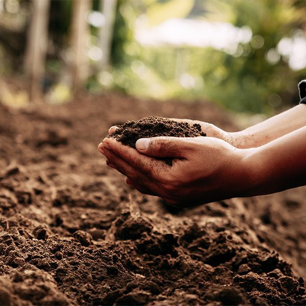
- An eye-catching cover image
- Your church’s contact information
These are your must-haves. Everything else? Fair game for the inside pages.
Make Sure You Add These Elements to Your Weekly Church Bulletin
Now that you’ve cleared some space on the cover, it’s time to make it shine.
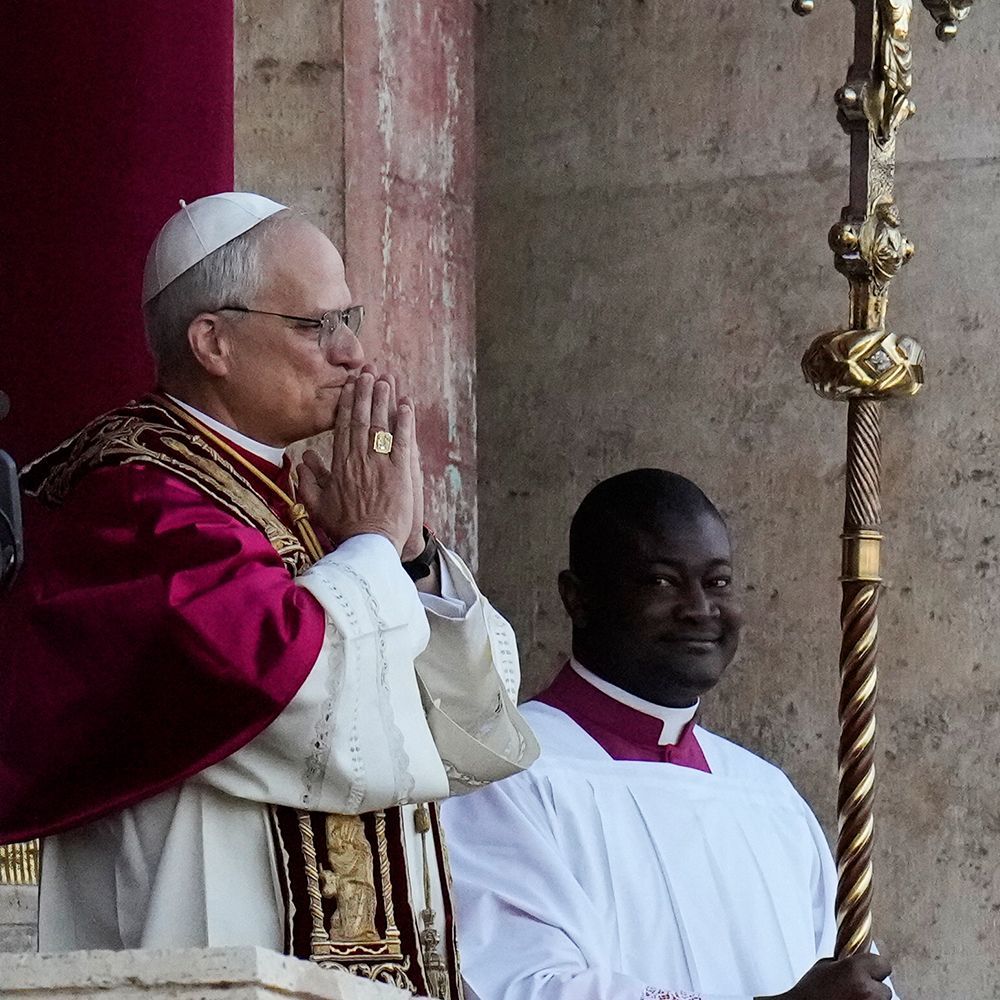
Beautiful, meaningful cover art goes a long way in making your bulletin feel welcoming. Consider using art relevant to the week’s Mass readings or selecting a cover image series that carries through the liturgical seasons. In fact, sticking to a cover art series creates a consistent and polished feel for both regulars and newcomers.
LPi’s WeCreate provides a variety of liturgical cover series, along with stand-alone covers for every week of the liturgical year, including holy days and celebrations. Did you know? Churches that partner with LPi to print their bulletins have free access to the entire WeCreate library of content. If your parish doesn’t print with LPi but still wants access to the beautiful catalogue of cover art available inside of WeCreate, subscriptions are available!
A custom masthead can also add a personal, professional touch. If the word masthead is new to you, a masthead is a design featuring the title of your parish in the top two inches of your bulletin cover. This is the perfect place to use your parish’s logo and branding. Your custom masthead will appear on each bulletin, unifying them under your intentional brand. If you don’t have a logo or brand yet, we can help you get started!
A simplified informational layout is important. Stick to the essentials — if you give out too much information on the cover, nobody will be enticed to open the bulletin! Prioritize the basics (outlined in the next point). They might seem obvious to you, but they matter to your readers — especially visitors. Don’t assume everyone knows the basics about your parish.
Prioritize What Matters in Your Weekly Bulletin
If you’re working with limited space, like on the cover of a church’s weekly bulletin, it helps to think in layers:
Primary Info: This is the information people are likely hoping to find on your cover.
- Church name
- Date of bulletin
- Parish address
- Parish main office phone number
- Parish website URL
- Priest’s name
Secondary: This type of info might be better placed on the inside cover.
- Your Mass times
- Welcome statement
- Social media handle
Tertiary: Information like this, although still important, would shine brighter on an inside page where it can be one of the focus points instead of being smushed into an already crowded cover design.
- Office hours
- Staff listing
- Mission statement
- Upcoming news or events
Let the most essential details take center stage on your cover and move the rest inside your bulletin.
Lastly, Ask Yourself (or a Colleague) to Appraise Your Parish Bulletin:
- Does the front cover feel welcoming and easy on the eyes, or is it too cluttered?
- Does the image you feature catch the attention of your viewers and enhance your bulletin’s visual appeal?
- Is there information on your cover that could live inside your bulletin instead?
- Is anything missing that would help someone feel more at home with your community?
If the answer to any of those is “yes,” it’s probably time for a redesign — something we specialize in!
Ready for a Parish Bulletin Makeover?
If you’re an LPi customer, you’re eligible for a FREE professional bulletin refresh — yep, totally free! This includes a new cover design template, customized for your parish, and a template for the rest of your inside pages, too, made by our in-house design team! Simply reach out to your LPi customer service representative to get started.
Not printing with LPi yet? No problem — we’d love to show you what’s possible.
For more church bulletin inspiration, dive into our free guide: Catholic Church Bulletins 101: Everything You Need to Know
Updated 11-19-2025
Share
You might also like
LPi Blog